THE “WHAT, WHEN, AND WHY” OF SAAS UX – THE KEY TO REDUCING CHURN AND INCREASING CUSTOMER RETENTION
8 out of 10 SaaS customers are willing to pay more for an improved SaaS user experience (Truelist).
A modern user opens every application with very high expectations for the user experience.
Those expectations are fueled by the fact that the most widely used applications today are often backed by a great UX design.
From social media platforms like Facebook and Instagram to SaaS applications like Google Dropbox, popular applications will surprise you with their user-friendliness.
That’s why most users have certain set standards for user experience using which they judge different apps.
UX designers have to meet those high standards even if it means going to great lengths and conducting extensive user testing.
The reason behind that is made clear by a recent survey which found that 95% of users decide whether or not to trust a platform based on its design (Social Media Today).
WHY AND WHEN TO INVEST IN SAAS UX?
SaaS applications usually have very complex software and functionalities. That can affect the user experience negatively if the UX designers don’t take certain steps to prevent it.
70% of the losses faced by SaaS businesses can be linked to a poor UX design (Kinsta).
If you are facing problems like churn and high bounce rates, it is time to start looking for ways to improve the UX design of your SaaS application.
If you have a platform that can monopolize the market with its unique selling proposition, you might be spared the effort of having to optimize your app’s UX.
That’s why Alibaba is so popular despite its terrible UX design.
However, if you don’t have such a monopoly over your market, UX design can be your key to gaining a competitive advantage and increasing customer retention while reducing churn and bounce rates.
Besides, there is a very famous statistic about UX that every dollar invested in user experience brings back between 2 to 100 dollars in ROI (Forrester).
WHAT CAN BE DONE TO IMPROVE SAAS UX?
When it comes to user experience optimization, some key principles are universal.
Whether you are designing the user interface of a SaaS application or an eCommerce store, there are some aspects of the design that will definitely affect user satisfaction.
Keeping these aspects in mind and optimizing the design accordingly to meet the needs of your users is key to launching a successful SaaS application.
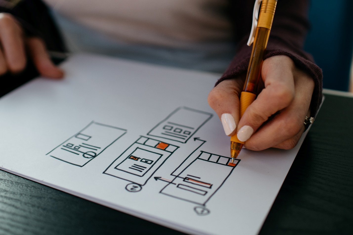
DON’T SKIP USER TESTING
Only 55% of businesses conduct user testing (SmallBizGenius).
That might be the reason why only 1% of users leave eCommerce websites completely satisfied (UXCam).
When you want to impress a user, the first step is to familiarize yourself with their needs and motives.
During the process of usability testing, you will be able to find out what part of your existing UX design is proving to be a challenge for an average user.
You will be able to see where a user gets stuck, what they can’t seem to figure out, and what changes can help increase their satisfaction with the app.
You can make some options more visible, reduce the space taken up by less important options, and even add some extra options based on user needs.
It costs much less to optimize a wireframe than it does to change the programming of a working application.

Getting user feedback at the right point during the process of app design can prevent you from having to dedicate a lot of extra resources to user testing and design changes further along the way.
SIMPLIFY THE SIGN-UP PROCESS
25% of mobile applications are only used once by an average user (Statista).
If your UX design does not satisfy a user the first time around, there’s a slim chance that they will ever return to give your application another chance.
The sign-up process can affect the first impression that your application makes on a user’s mind.
The first impression of your app might also end up becoming the last impression if the user finds the sign-up process too complicated, lengthy, or slow.
Make sure that you take as little information from a user as possible during the sign-up process.
That will remove any unnecessary friction and reduce the possibility of a user being frustrated by a lengthy sign-up process.
A great way to reduce the number of clicks involved in the sign-up process is to give users an option to sign up using their Google or Facebook profiles.
That option is available in most applications, and users are usually not fond of having to fill out lengthy forms just to create an account.
CREATE A COMPREHENSIVE ONBOARDING PROCESS
When was the last time that you had to talk to customer support to find out how a website or app works?
That’s right – never.
Like most users, you also abandon an application when you find its interface too confusing.
Most SaaS applications have a very complex type of functionality that users need to be familiarized with before they can start using the app.
A step-by-step guide for new users can be a great way to help users find out where they can find the options that they need.
However, they must have an option to skip the onboarding screens in case they already have some experience with the SaaS app’s UI.
It can contribute to user frustration and dissatisfaction if they are forced to go through the same onboarding process even when they don’t need it.
MAKE NAVIGATION AS EASY AND QUICK AS POSSIBLE
Reaching the right option should never be a very lengthy process.
Try to reduce the number of steps between the point where a user opens your app and the point at which they arrive at a functional screen.
A functional screen is usually located at the end of the navigation through different options available in a SaaS app.
It is where a user can get the intended job done.
A great way to do this is by combining relevant options into groups and keeping all of those groups easily accessible and visible on the homepage.
Most SaaS apps have various functionalities which can be entirely different from each other.
If most of your users need all of your functionalities at the same time, you can add an option for each function on the homepage.
If your app has different types of user personas and all of them need to access a different side of the app, ask them a few simple questions right after they sign up to decide the user type and the default settings for them.
Make sure that your design is not dominated by any one of the different sides but is equally easy to use for all 3 types of users.
REDUCE THE CLUTTER ON EACH SCREEN
As a UX designer, it is very easy to end up creating a lot of clutter on a screen by adding too many elements.
Users hate cluttered screens and usually get very frustrated when they can’t find the right option fast enough.
Deciding how much visibility each element should have can be a very tricky task.
User testing can help you in this field as well.
Create a user persona based on your target market and find out what options most users are likely to need.
Make sure that they have access to every option they need even if it is one or two steps away.
Grouping different functions together can be a great way to solve this problem too.
It will help you maintain the functionality while reducing the clutter on the home screen.
KEEP THE USERS INFORMED ABOUT EVERYTHING
When it comes to SaaS applications, keeping users informed about the “current state” of their profile can be very important.
A dashboard that provides them with all the required insights at all times can be very useful.
Again, make sure that you avoid adding too many insights on the same screen and cluttering it up with information.
You can group insights and add one insight from each group on the dashboard.
When the user clicks on a specific type of insight, they can land on another screen with more, similar insights.
NEVER IGNORE THE AESTHETICS
Most users perceive prettier designs as “more usable” (Nielsen Norman Group).
It is a basic human trait to judge things by the way they look, more than anything else.
Given 15 minutes to consume content, two-thirds of people will prefer content that looks great (Transaction Agency).
From the font to the color palette, everything affects your brand image.
Make sure that your SaaS platform delivers a strong message with its looks and its aesthetic appeal.
If your app design is less appealing, it will automatically end up losing points against a competitor’s design.
With the rising competition in the SaaS industry since the pandemic in 2020, it has become increasingly important for businesses to make efforts for the slightest competitive edge.